crafting a better, future-proof navigation for the yoco merchant app.
100%
Increase in engagement with offers and feature discovery
Lead product designer
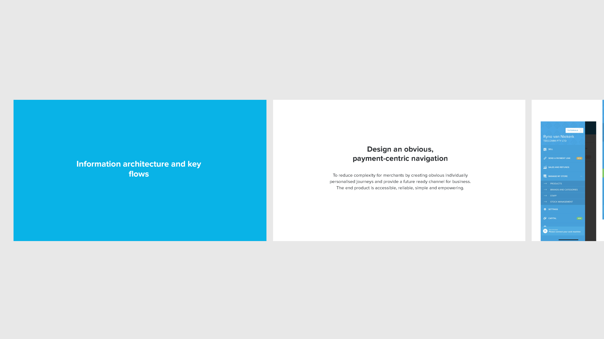
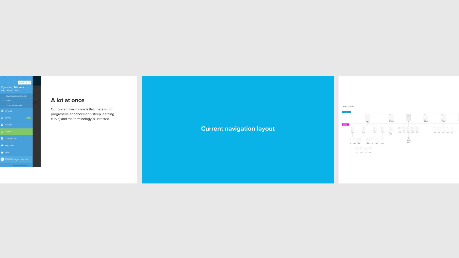
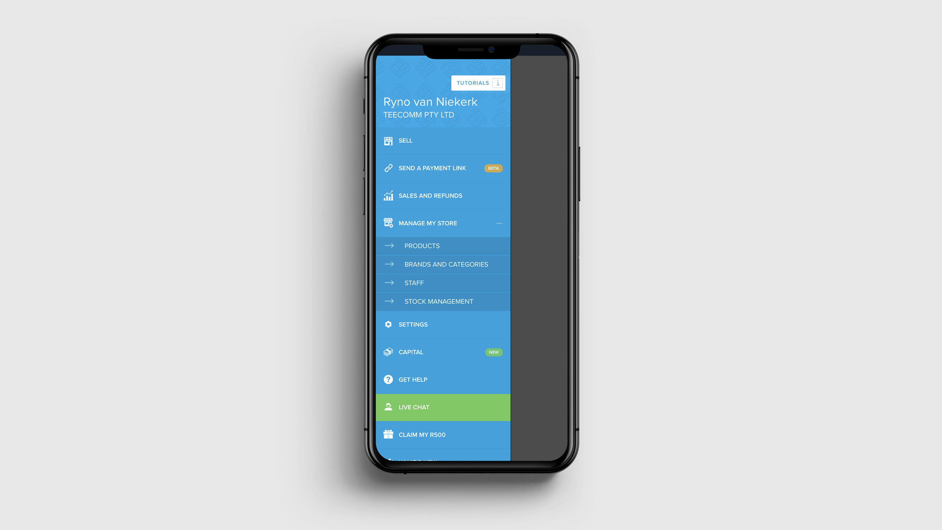
The Yoco merchant app houses a lot of features from point of sale, to digital payments, reporting, support and some vital communications. Our app navigation wasn't geared for easy discovery and it became difficult to figure out where to house new features for our 5 product teams. Knowing that the business would only grow and enhance its offering. After some customer and internal stakeholder interviews we decided we needed a logical hierarchy, new labelling and a much simpler, more intuitive presentation to the user.
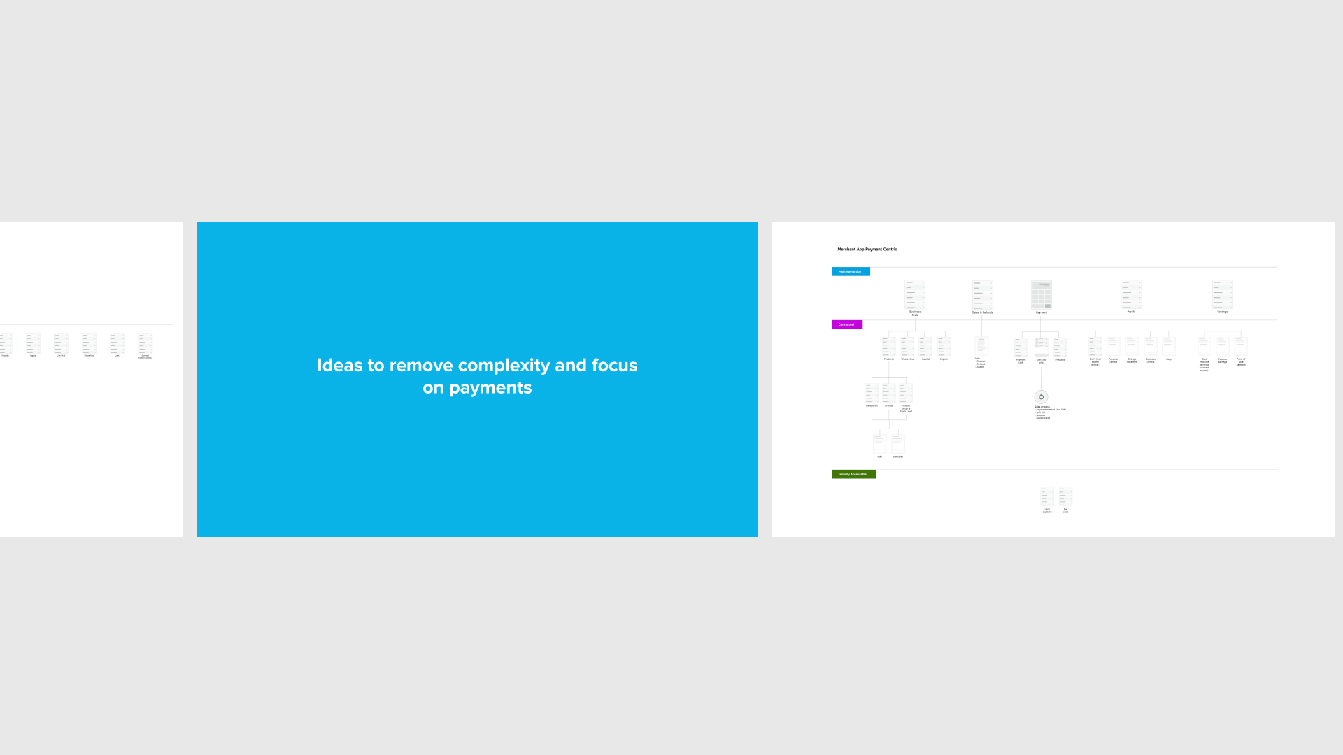
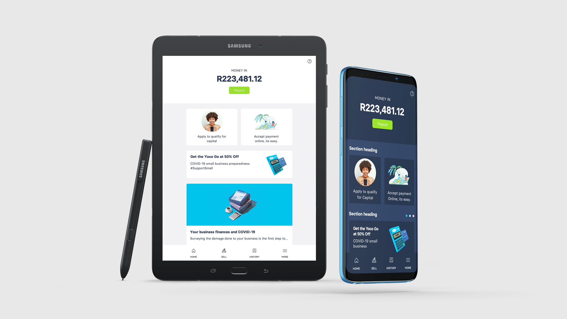
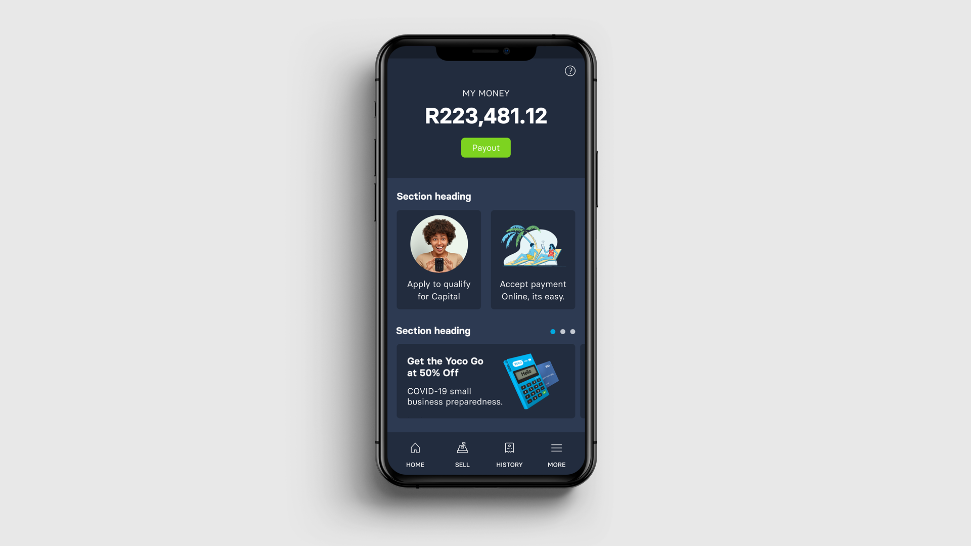
I helped lay better foundations by prototyping and testing simpler layouts of our information architecture with Yoco merchants. We created a beta version of the app, reimagined with a new bottom nav and dashboard screen and tested feature discovery against the old one in control groups of increasing size.
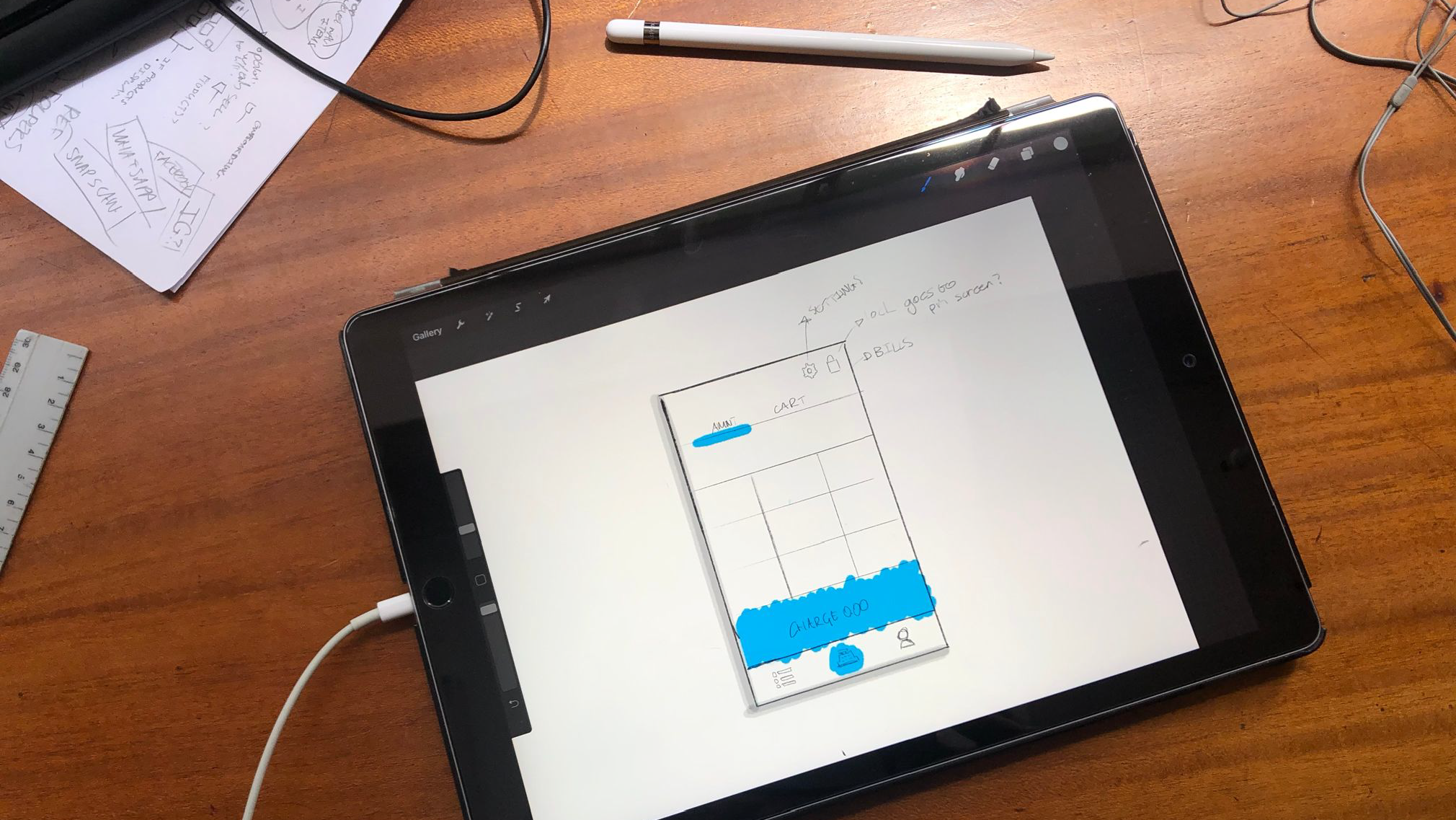
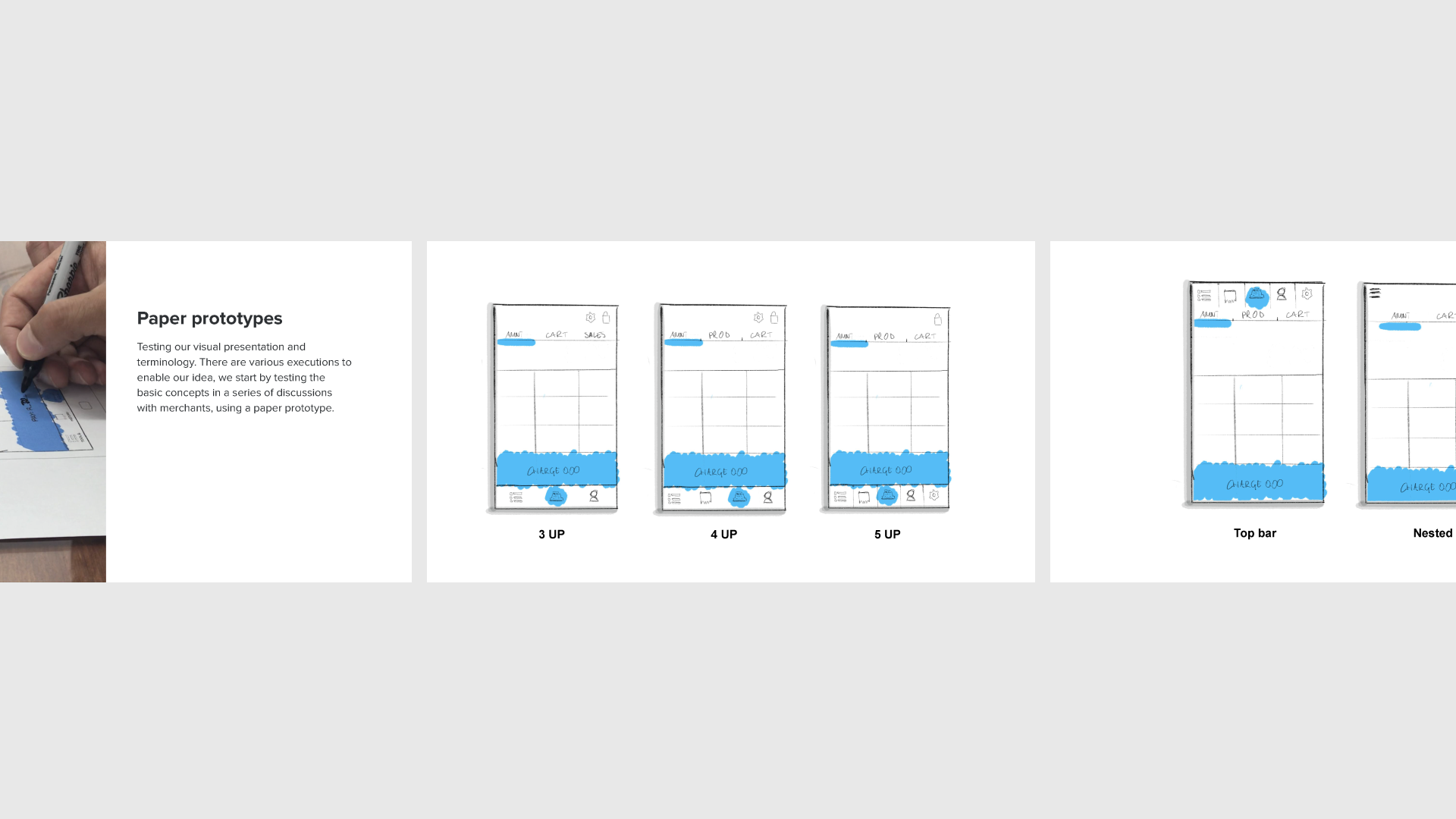
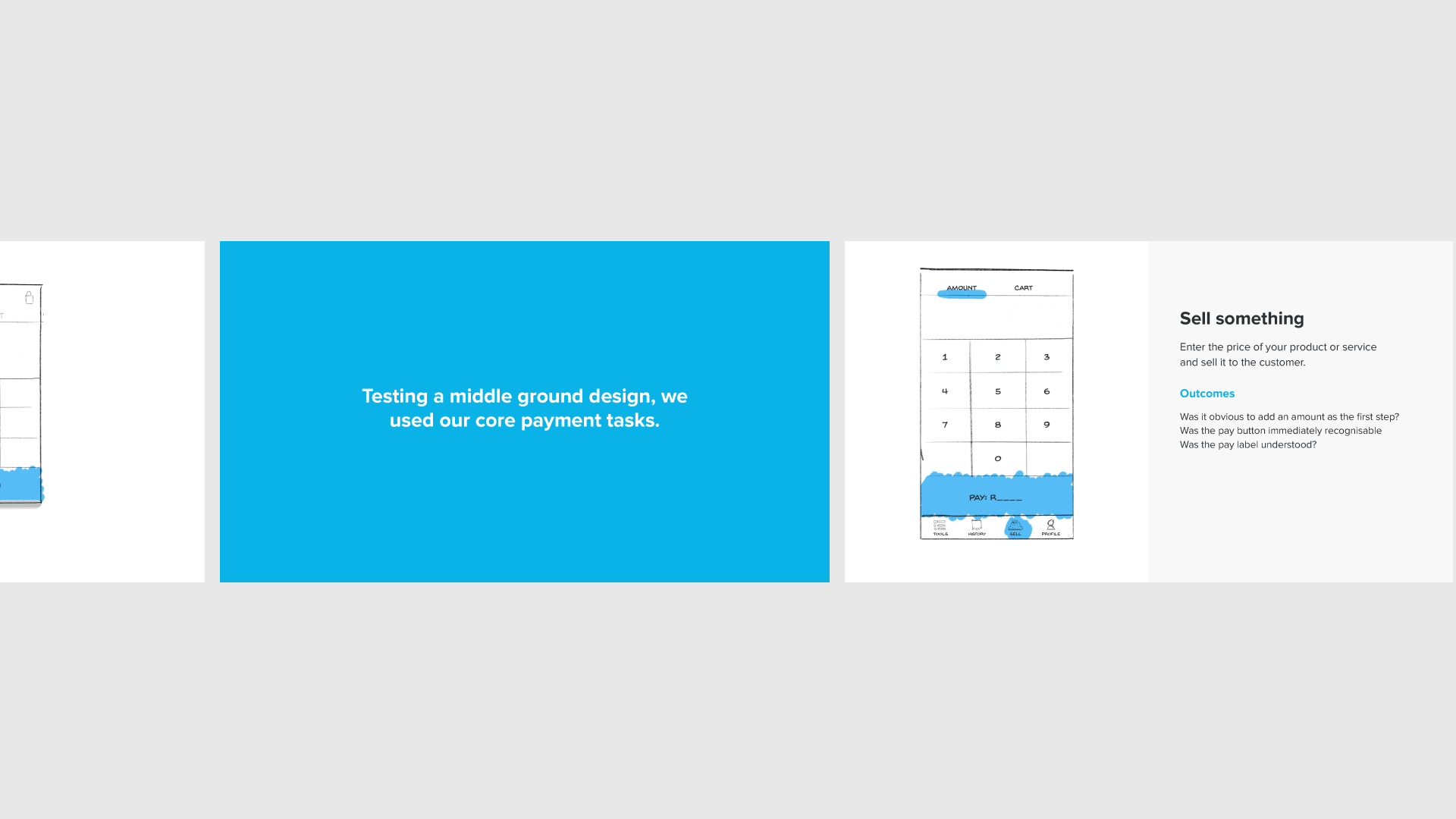
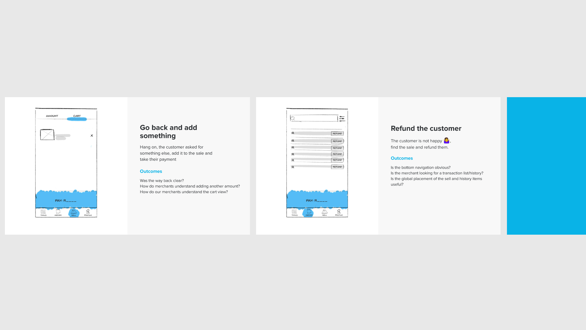
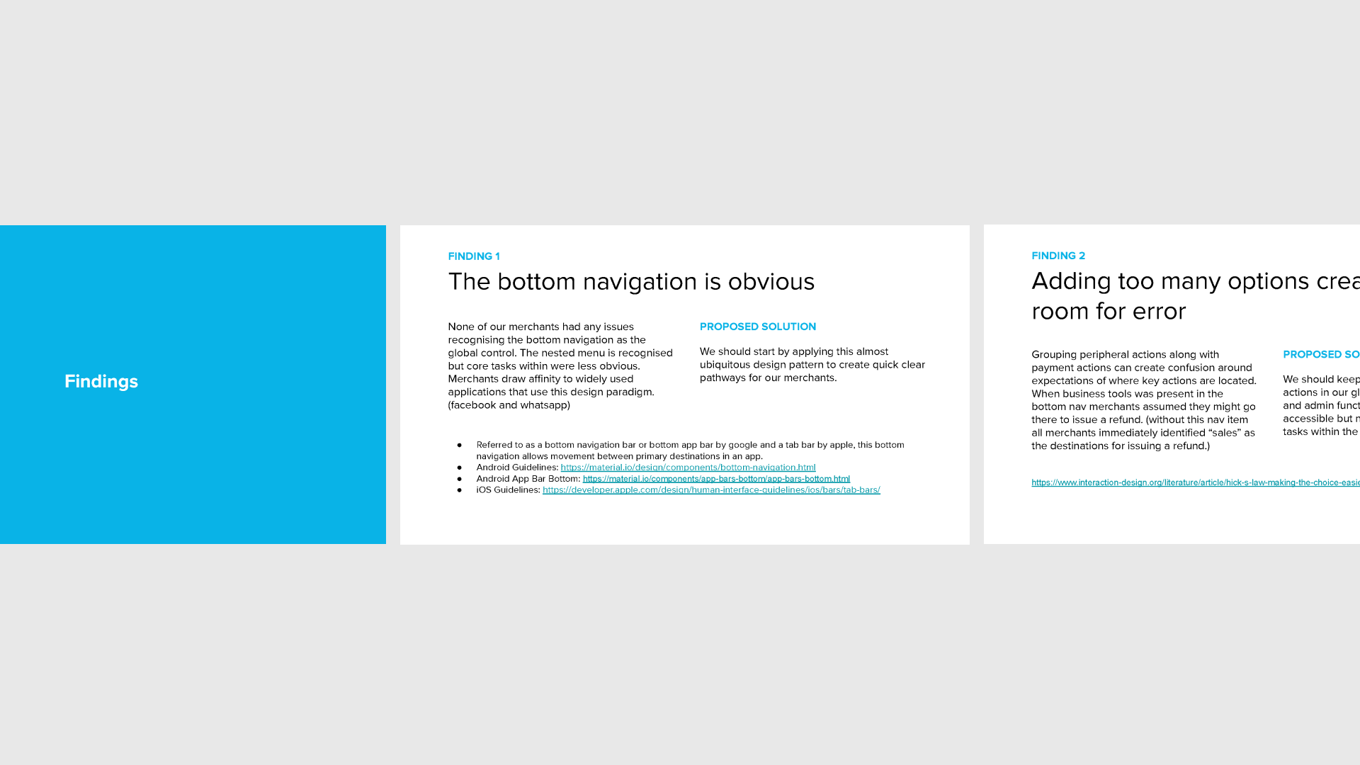
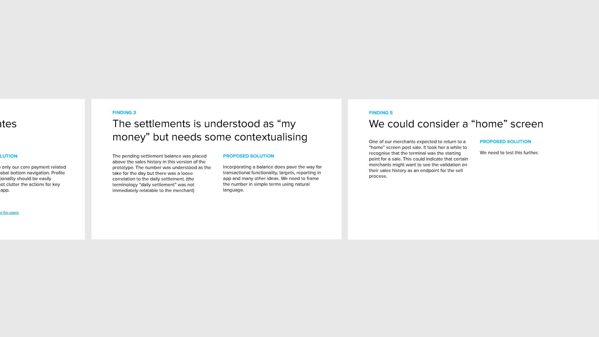
I tested the original navigation and some new ideas on a few new and existing customers. I ran through scenarios with paper prototypes and presented the findings back to my team with recommendations. The idea was to revert to a platform default bottom bar and add a landing screen when not in a sales flow that could communicate vital messaging to the user timed along the customer lifecycle. The app would always return to a users last visited screen as an over arching rule. I packaged the findings and resultant design and presented to the stakeholders on the project.
Our team decided that we would implement behind feature flags to portions of the user base over time, this would allow us to learn and adjust our approach along the way. We created rules to govern the messaging shown to customers, so that we could augment existing CRM efforts to help customers get setup and functioning with the product without being pushy or irritating, we were mindful to not show news or lifestyle content within a product being used for a customers work environment. It was the first time we used the native app as a communications channel in this way.
We tracked the impact on new feature discovery, key messages and prompts to assist users along their journey.
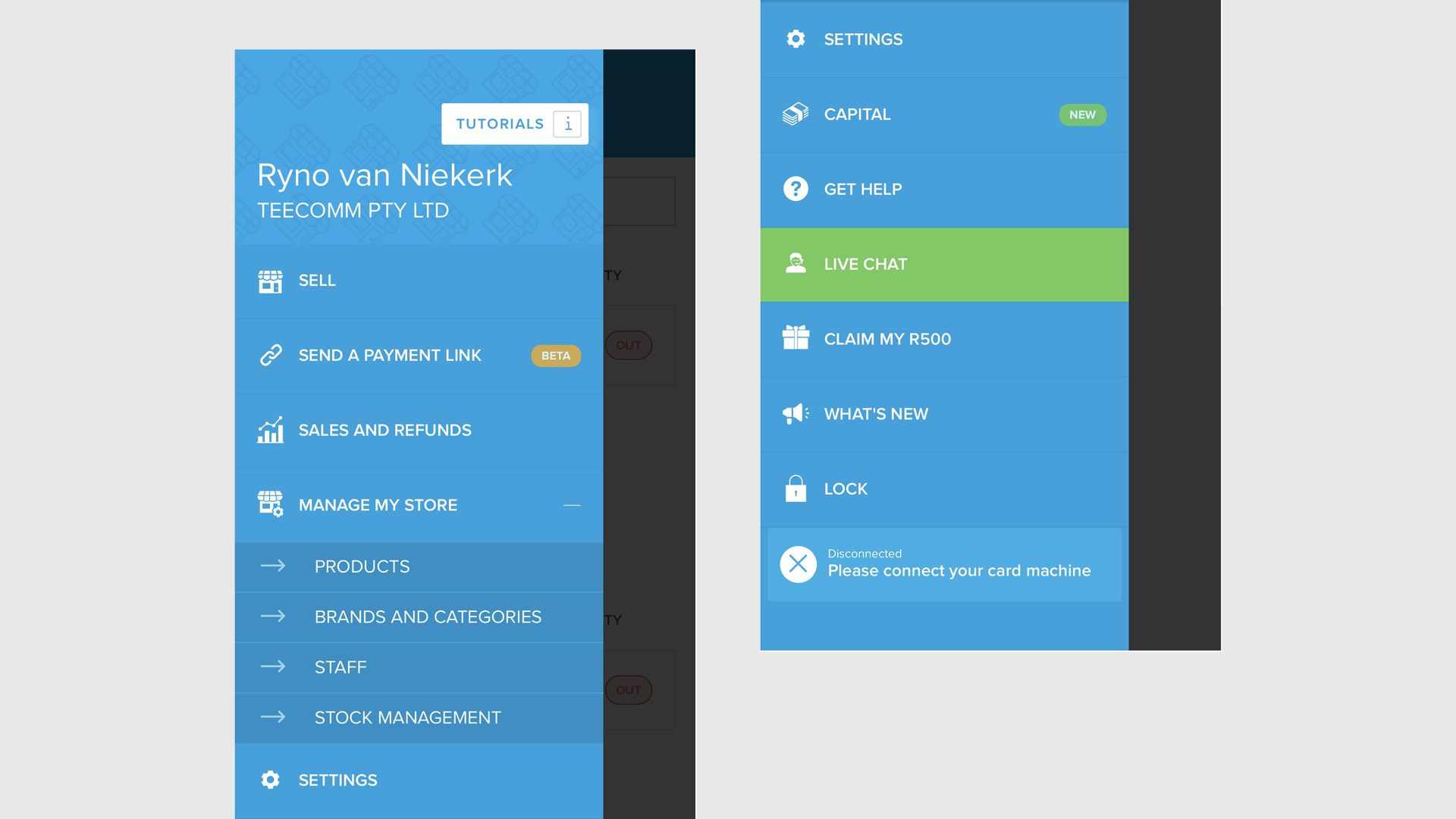
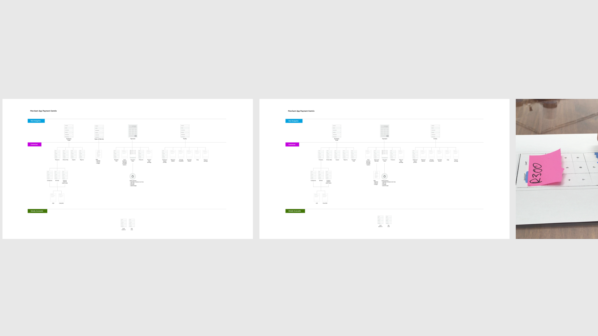
The legacy navigation
user interviews with paper prototypes
Results
Increased engagement with our features and offers
An extendable navigation that customers and Yoco teams understand
